CHARLOTTE RUTHERFORD is perhaps my favourite up-and-coming photographer. For someone who began her interest in photography by taking selfies for myspace, she has such a unique and captivating style that really makes her work stand out amongst the dozens upon dozens of new, fresh-faced photographers clogging the internet.
Originally her work started off as very generic - basic editorial stuff, but that was the kind of jobs she was getting as a fashion photographer. It didn't stand out and was merely basic marketing of basic clothing. However, after one rather experimental photoshoot Charlotte says she had the realization that she could "do whatever she wanted" with photography.
That's the modus operandi I try to follow. Do whatever you want, do what you want. If you do what others are doing, you work is gonna look like what others are doing.
Her work is a breath of fresh air and will always be an inspiration to me.
AMBER ROSE for PAPER MAG
http://www.papermag.com/amber-rose-feminist-heroes-1488371818.html
For her photoshoot with feminist Amber Rose, the theme was to recreate iconic looks, posters and feminist movements in the past hundred years. In this particular photograph, Amber is modeled after J. HOWARD MILLER's iconic World War II era propaganda poster, "We Can Do It!!" featuring Geraldine Doyle.
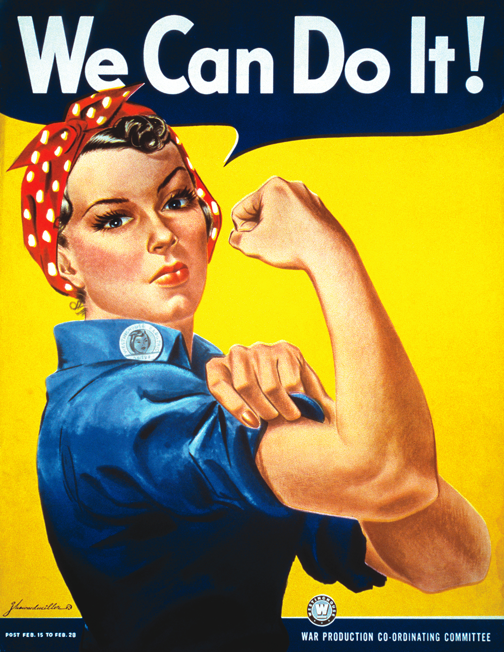
What makes this photograph is Rutherford's take on it. Not only does she break the rules of colour by purposefully clashing the blue-on-blue, which would theoretically make Amber look like she's drowning in the background, Rutherford actually circumvents it with the colour gels on either side of Amber. By including powerful red and yellow lights on the edge of Amber's figure, it helps define and separate her from the background despite being dressed the same. In what can only be described as a clever piece of trickery, the blue no longer swallows Amber but ends up highlighting the image as a whole. Your eyes are drawn to the bold, matching colours while the red and yellow stop the two melting together.
a
whirlwind romance
with
colour gels
A staple of RUTHERFORD's work is her provocative use of colour gels. It's identifiable in almost all of her work including her videography and music video direction. I'm personally a massive fan of colour gels myself and find the various uses she has for it inspiring. However, I think some of her work becomes very limited and predictable even if it is in keeping with her style. Like DAVID BAILEY and ALEXANDER MCQUEEN, you can have a recognisable style but still try different things that keep each of your photoshoots/collection distinguishable from each other.
"Ladies and Their Lizards" for VICE MAGAZINE
http://www.vice.com/en_uk/read/ladies-and-their-lizards-294
"Jungle Babies" for SOPHIA WEBSTER SS15
https://www.sophiawebster.com